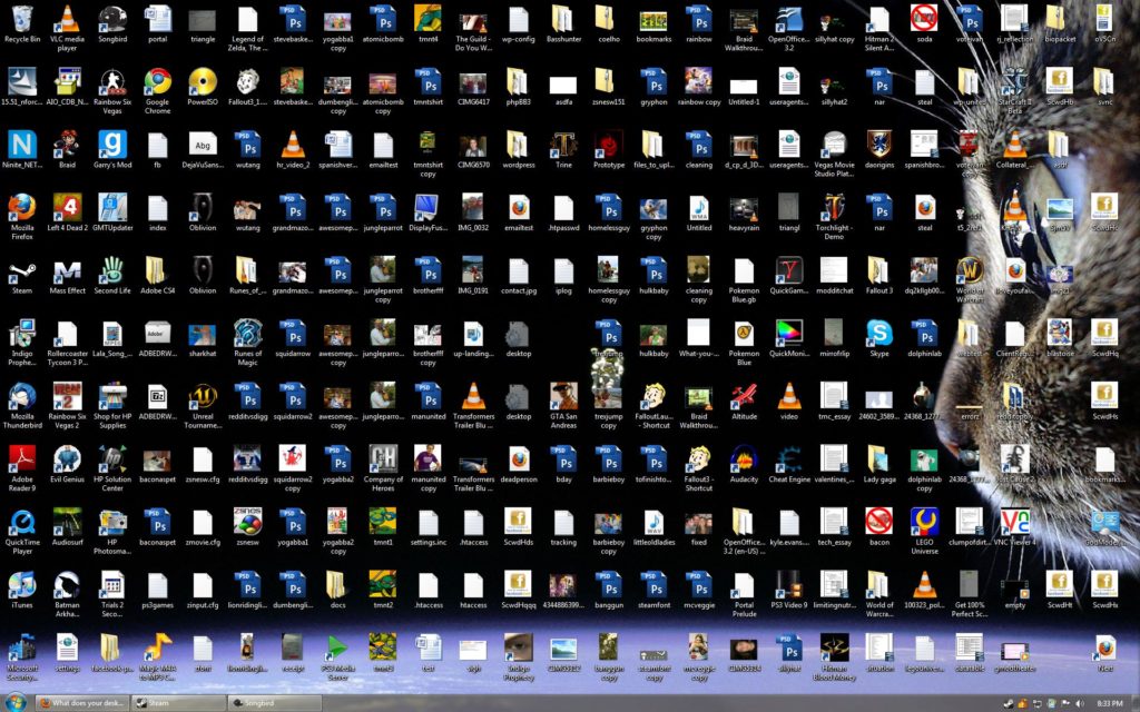
There’s a simple, easy solution to your nasty-ass desktop.

There’s a simple, easy solution to your nasty-ass desktop.
I’ve been creating some short screencasts to help a friend transition from Windows to a new Chromebook. This includes some iOS apps. As I get ready to show him the Google Calendar app, I’m reminded of the calendar I saw on his refrigerator. It’s the “family calendar” where everyone keeps up with who’s where.
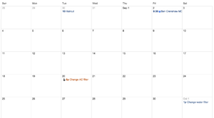
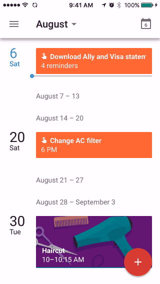
This got me thinking about the seven columns/four rows layout of calendars. I always took this for granted until I started using the “schedule” view in Google’s iOS app (see GIF below). This linear, flowing presentation makes perfect sense on a smart phone where you can endlessly scroll (or search). And the 7-by-4 layout of paper calendars don’t work as well on smaller screen.
The 7-by-4 layout makes sense if your calendar is printed on a sheet of paper (as it has been for hundreds of years). And if we’re going to share the calendar, we have to be looking at the same piece of paper. Not so in a cloud-connect, smart phone world.
In front of my laptop, I still opt for the month view in Google Calendar but I’ve gotten used to the schedule view on my phone. Will the 7-by-4 view be with us always or will it become a quaint anachronism for those who never knew anything but smart phones?
The idea is to recommend music based on my existing iTunes library along with the genres and artists I ID’d when setting up Apple Music. (I never found Pandora’s algorithm very good at this. The other services might be better.) It’s only been a few days but I’m impressed, especially with the playlists. Seeing my favorite artists/music as well as deep tracks I didn’t know existed. With stuff by artists I’ve never heard of. This experience will only get richer (I hope) as I continue to provide feedback by listening an liking playlists and individual tracks. This browse runs 9 minutes but you can bail after a couple and still get the idea.
The slideshow above runs two minutes. I made it with the slideshow tool in Photos (formerly iPhoto). For some reason, I always made these in iMovie. I think I just forgot I could create these from within iPhoto/Photos. Much easier this way. Half a dozen themes/music to choose from.
In the small town where Barb and I spent some of our best years, it was not uncommon for someone to pop in, without calling, with a six pack and just hang out. Before the evening was over, there could be 8 or 10 people, just hanging out. Nothing planned, no preparations.
I think that’s sort of what Google was going for with the Hangout feature on Google+. To make it that easy and that comfortable to hangout with friends. And I think they nailed it.
The video above does not do justice to the quality of the audio and video. Or to the ease of making it happen. I can easily imagine myself surfing mindlessly with the Hangout light on and people dropping by to chat for a few minutes..
You have to try it to appreciate it.
With more 120 logins and passwords to keep up with, a post-it note on the side of my monitor just doesn’t cut it. As for using one password for ALL of my accounts… I won’t dignify that with a comment. This little (6 min) tour doesn’t begin to do justice to 1Password, the Best of Category.
This little screencast runs under 5 min and features two of my favorite tools for taking notes. Notational Velocity is an application that stores and retrieves notes. Really fast. Simplenote replaces the Notes app on your iPhone, iPod touch, or iPad and lets you access your notes from anywhere.